A flexible, living design system and digital guidelines for ultimate brand consistency
Background
Having already previously worked closely with Tusker on trying to update and modernise the look of some of their digital touchpoints including their customer-facing website and Driver Portal, I was asked to help them build a Digital Guidelines – to be used by developers and designers in their digital team across all digital projects including web, email and advertising to ensure consistency across the board.
Approach
The client wanted something that could be editable and flexible, preferably in Figma. So rather than produce a static guidelines document, I recommended building the guidance in-situ alongside the creation of a proper design system. As well as being more developer-friendly, this would enable much easier expansion or modification later on, while giving the team more solid guidance on things like accessible colour pairings and responsive behaviour.
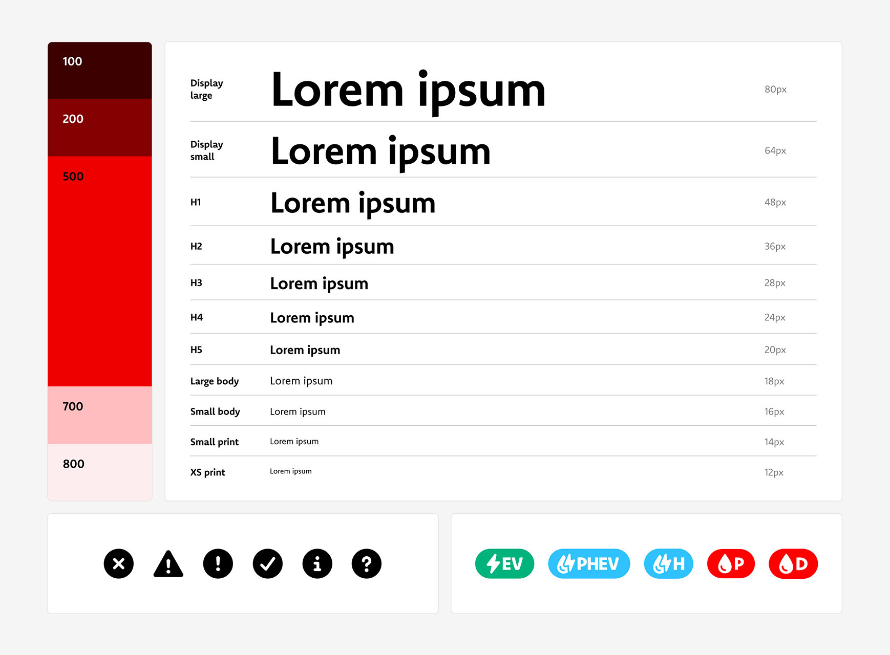
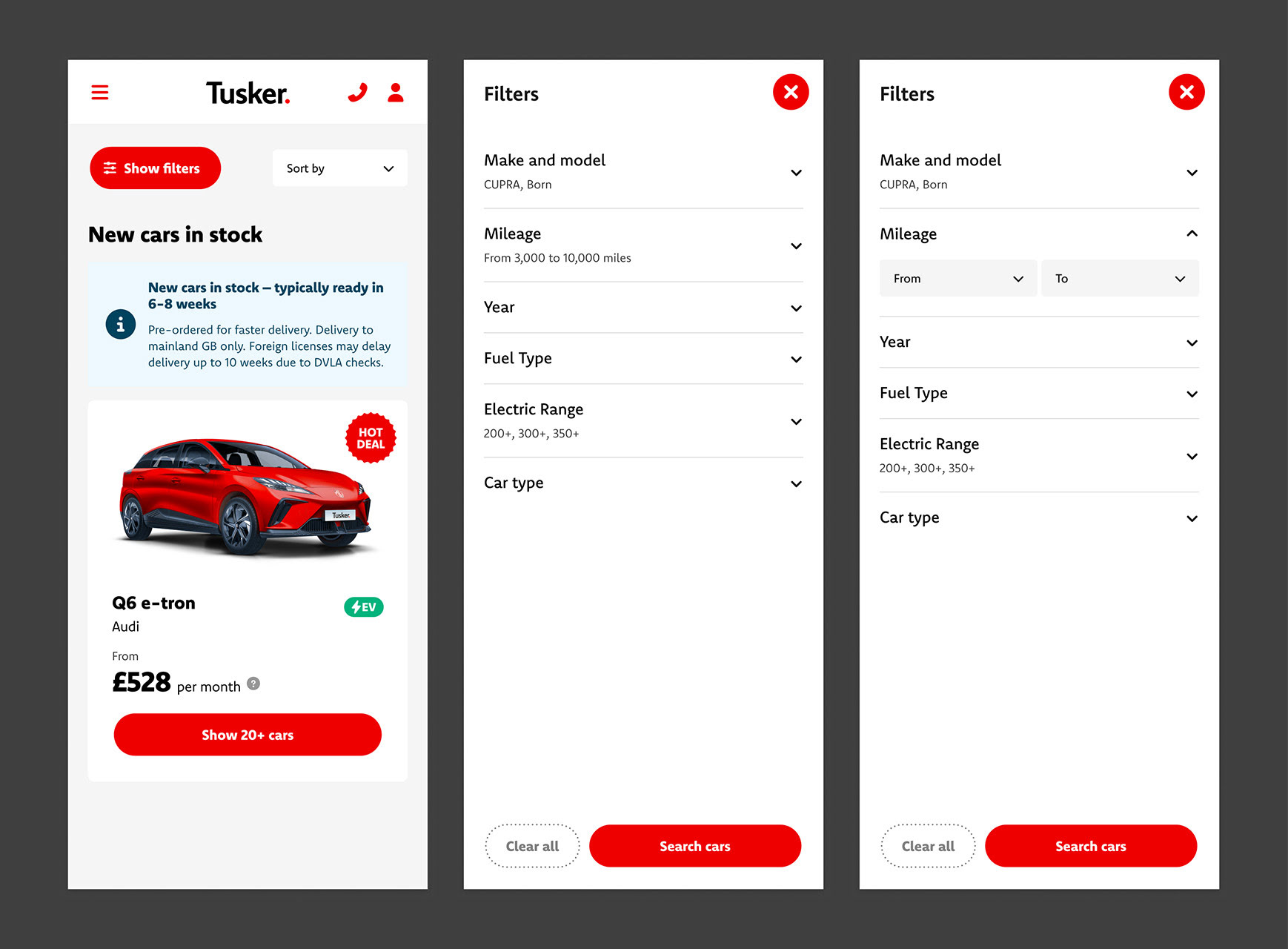
Starting by defining variables and tokens for attributes like brand colours, typography and spacing values, a design system can then gradually build up in complexity – from basic elements like buttons and form components, to modular arrangements of elements like a product card or navigation menu, all the way up to full page designs.
Outcomes
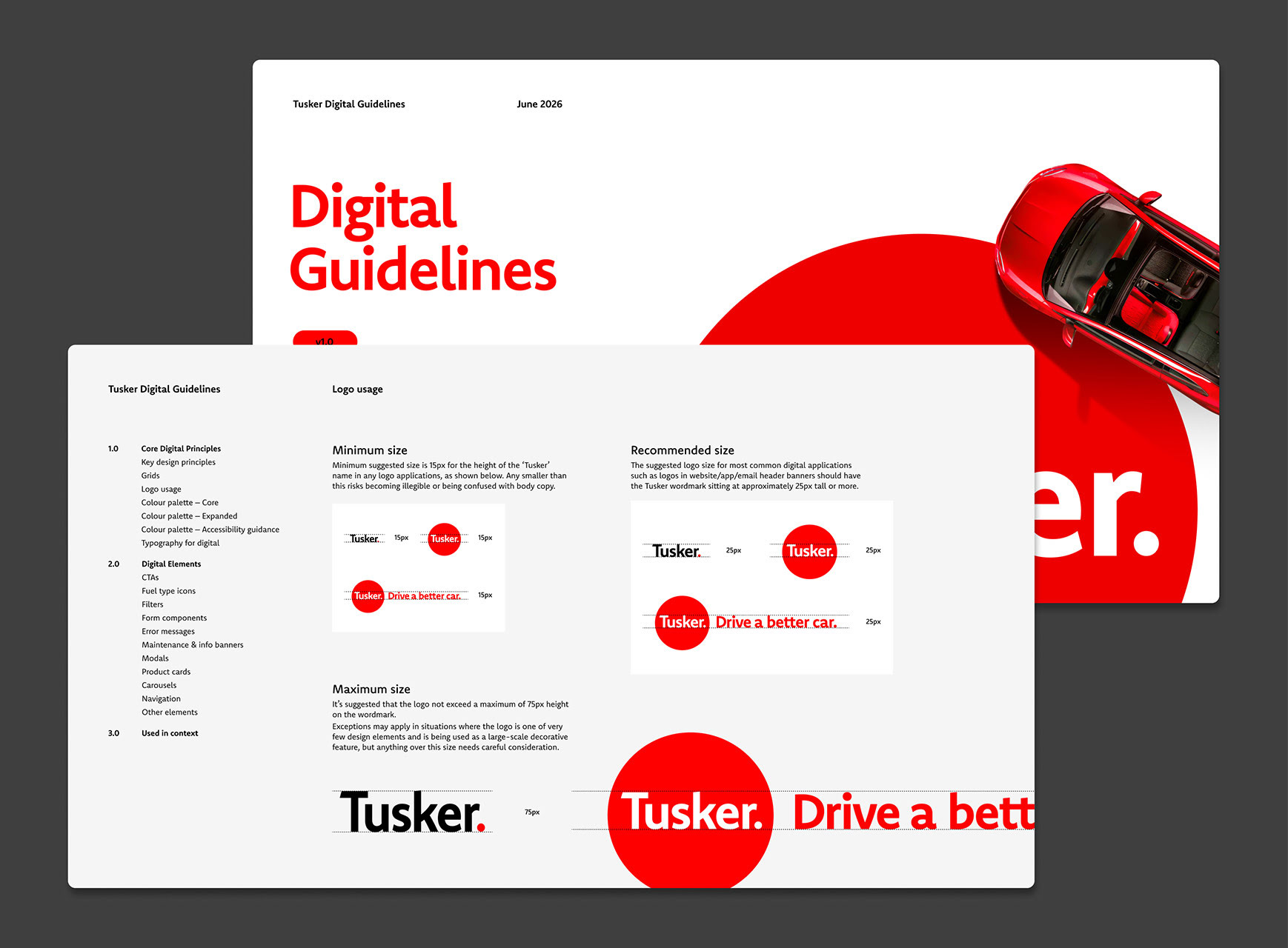
The output was a document that looks similar to an ordinary brand guidelines, and which could seamlessly be output as a PDF and appended to their existing guidelines documents.
But the document would also give the client the ability to jump from any examples shown in the guidelines to a master component, edit the underlying variables at any time to instantly update every component, or build out new elements using the styles and precedents established.
The guidelines cover everything from grids and logo usage, to colour palette, typography and spacing, CTAs, forms, modals, error & info messages, cards & carousels, navigation and more.